Robot Controller
Software re-design to reduce setup time for lab automation
Sketching
High fidelity prototypes
Paper prototypes
Benchmarking
Interaction design
Hallway testing
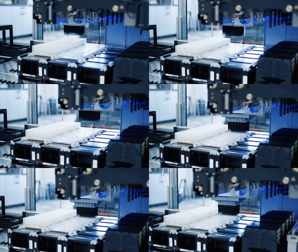
Animation of a robot transferring liquid. The white rectangles are 96 well containers.
Design Challenge
A quick science lesson
For the sake of this case study, consider a biology experiment the act of mixing various liquids together and measuring the outcome
Scientists at Ginkgo use robots to mix tiny amounts of liquid inside containers. Containers typically have 96 or 384 wells, laid out in a grid
Inside each well is a sample of liquid that plays a role in the experiment. Samples can be DNA, cells, chemical reagents, controls, etc.
Scientists need to instruct robots when and where to mix each sample prior to running their experiment
Ginkgo scientists need easy-to-use robots
For Ginkgo scientists, access to automation can be either a luxury or obstacle. New employees join as experts in their field (biology.) They aren’t necessarily experts at programming robots
The software used to control robots needs to be efficient with a low learning curve
If the software is too hard to use, scientists will opt to run experiments the ‘old fashioned way’ (by hand), which is slow and error prone
As Ginkgo scales, the business cost of inefficient software multiplies
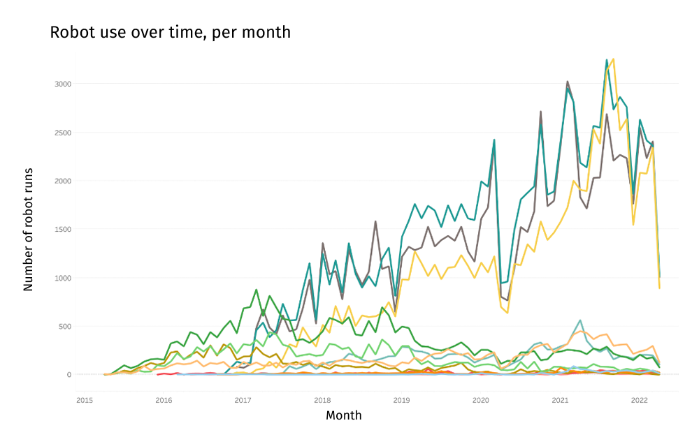
Graph depicting robot use over time. The takeaway is robots use increases each month.
The old software wasn’t meeting their needs
The old software was built while Ginkgo was in it’s early-stage startup phase, there was no designer (or PM) at the time
Users were abandoning the software in favor of DIY workarounds, they weren’t tracking their experiments using Ginkgo systems
From prior research, we knew it took months before scientists could run their own experiments on the Ginkgo platform, this software was a big culprit
Screenshot of the old software. The design is confusing.
“The software provides the functionality you need to do your work, but the UI is not the most intuitive”
“It’s much faster and cheaper to do liquid transfers by hand if it’s small scale.”
“I find it frustrating to spend a lot of effort creating a beautiful liquid transfer only to find that I messed up.”
It was time for a redesign
The new design should require little to no training
The new design patterns must be flexible and extend to future use cases
Setting up an experiment for a robot should take less time than it takes to execute the same experiment at the lab bench
Actions Taken
We formed a team
I worked with 5 developers, 1 PM, and a PM/UX hybrid
The PM/UX person was considering a career change to UX. She lead the discovery research that fed into this project, and contributed to most of the user research highlighted in this case study. I showed her the ropes and walked her through my UX process at every step. (She eventually transitioned to a full-on UX designer and took over this project for 2 more years)
Sketching helped me explore many ideas quickly
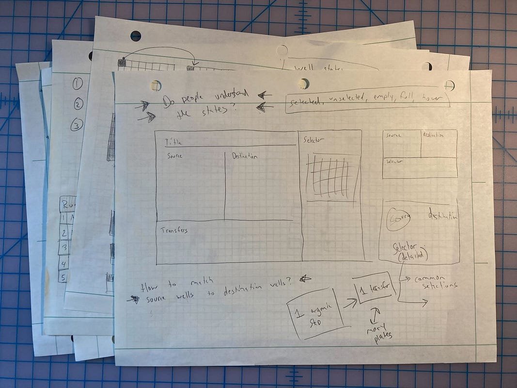
I used sketching to lay out the new interface and establish an information hierarchy
Prototypes were a quick, cheap way to bring ideas to life
I used prototyping software to rapidly iterate through as many ideas as possible
I tested with paper prototypes for fast feedback
Once I was happy with the first round of designs I printed out each screen and showed them to 10 scientists over 2 rounds of feedback
I gave each user testing participant a marker and encouraged them to draw on top of the prototypes. I asked them to think out loud as they went through each screen
I also prepared some questions to probe their mental models and understand key concepts
Do scientists read both images as a single transfer? (Example research question from user testing)
I evaluated other designs in the wild
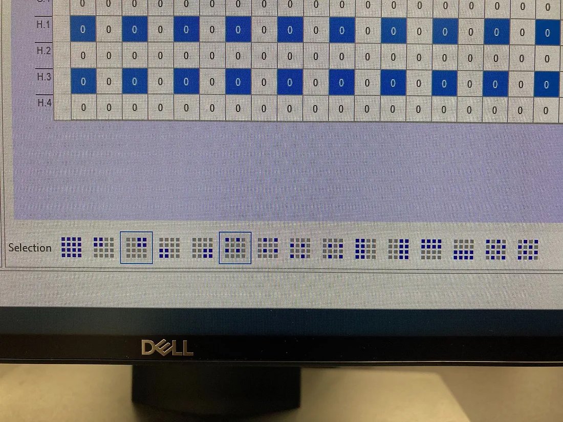
Several participants pointed me towards a piece of software with a similar interaction (used for a different purpose)
They particularly liked the selection buttons at the bottom of the screen
I incorporated similar selection buttons in my prototypes
Users wanted a quick way to select “quadrants” of wells within each plate
Working through the details was tricky
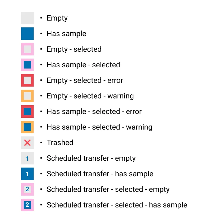
The hardest part was designing visual encodings for the sample selection widget
Each container well rendered at 16 x 16px and I needed to pack a lot of information into a small space
I made a legend to keep track of all the possible states for a container well
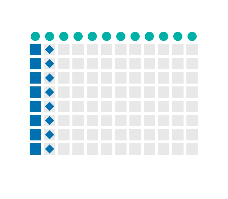
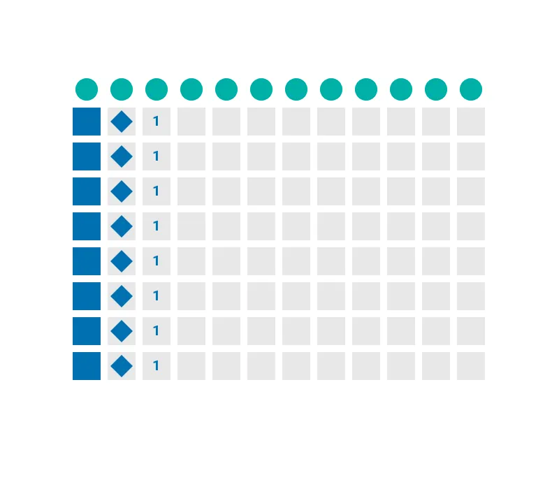
I needed to understand if my visual encodings conveyed meaning were readable at small sizes. I printed out images like these to see if users could understand them without additional context. (We ended up scrapping the diamond shape)
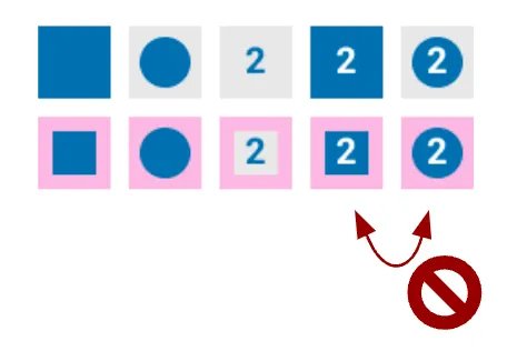
Another example of a design we scrapped, it was too slow to read and determine the difference
I collaborated with the dev team as they built out the designs
The engineers shared feedback on technical feasibility and used the designs to inform their data models
One of the engineers built the original software and was eager for the opportunity to improve it
The PMs participated in each round of user testing
We all worked together to solve for unexpected edge cases uncovered during coding
We ran hallway testing to catch any last-minute issues
I suggested we run hallway testing and helped write an interview guide
The PM and an engineer paired up to run the testing (I couldn’t attend that day)
Together they intercepted 17 scientists in the cafeteria
The hallway testing resulted in numerous improvements prior to launching the MVP
Ryan, a software engineer, in the cafeteria exchanging snacks for user tests 😁
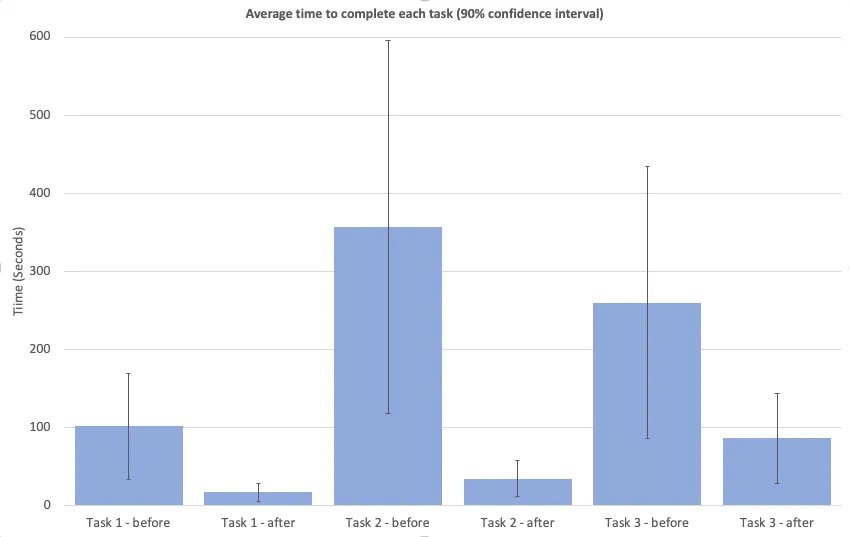
We benchmarked the old UX vs the new MVP
My teammate (the PM/UX’er) identified 3 critical tasks to be our benchmark KPIs
She ran a benchmarking study with 8 participants
She timed the same task on the old UI vs the new UI
She did not offer assistance, ask questions, or encourage participants to think out loud for this style of testing
I helped her with the data analysis
Outcomes
Benchmarking showed big improvements 📈
We were thrilled with the improvements for task 1 and task 2
We were surprised just how much the MVP outperformed the old UI in task 3. (Task 3 required some manual clicking in the MVP that we later automated away)
Results from the benchmarking study
Ginkgo scientists execute these tasks hundreds to thousands of times per day.
This had a huge impact on the company’s bottom line.
Screenshot from our MVP launch
“It’s especially good for new people who haven’t used liquid transfer before. It’s faster for them to catch up”
“This was super easy”
“I tried using it without any documentation, which is my idea of good software. It didn’t take me long to figure it out”
I handed the project off to a fellow designer who continued to iterate and improve upon the MVP
One of the PMs for this project ended up switching careers to UX
I encouraged her to continue on this project in her new UX role
I offered plenty of support and guidance as she encountered new design challenges. I’m very proud of the amazing designs she later created
The development team spent the next 2 years delivering powerful new features on top of the design patterns I established
That’s it, thanks for reading 👋
